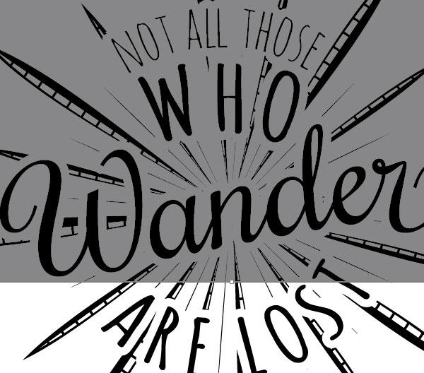
In this tutorial, I am going to show you how to use Adobe Illustrator to lay out the text of a quote and create a retro, hand drawn text effect. I will also show you how to create a stylish retro starburst around your type via use of some custom brushes.
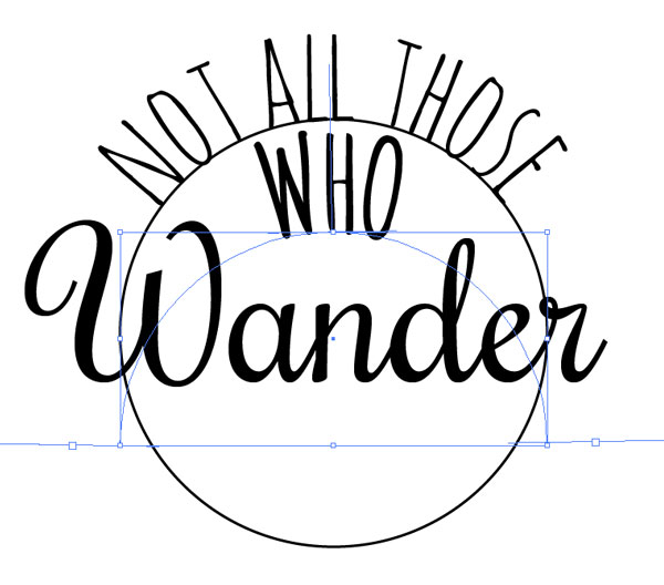
Step 1: Choose your quote. For this tutorial, I am using the quote “Not all those who wander are lost”. Before you begin, you want to decide which word will have the emphasis. I like to start by typing out the full quote. In this example, the word “wander” will be the focus word, so I need to decide where to break up the rest of the text. This will be a circular design, so I want to break up the text so that it will fit. As you work, you can always change your placement, but this is good to start with.

Step 2: Font selection. To make this tutorial easy to follow, I will be using some free fonts from fontsquirrel, but you can use whichever fonts you like. For “Wander” the font is called Rochester (http://www.fontsquirrel.com/fonts/rochester). The rest of the text is Amatic (http://www.fontsquirrel.com/fonts/amatic).

Step 3: I am going to move my text over to the side and drag a copy of “Wander” over to start working on the layout. The first thing I am going to do is draw out a simple circle. Select the Ellipse tool and hold down the shift key while you draw the circle to make sure it is a perfect circle shape. Move the circle so it is approximately in the middle of your focus word.
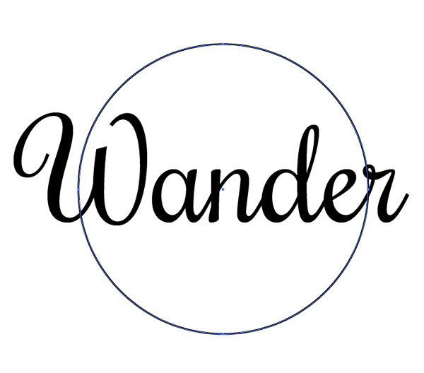
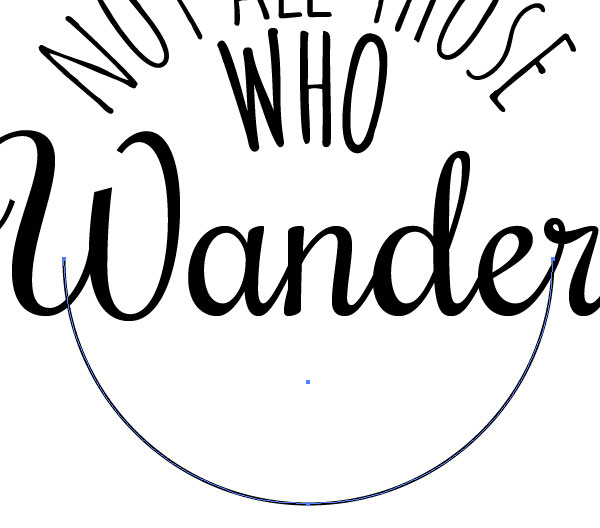
Step 4: Make a copy of the circle (Ctrl + C) and paste in front (Ctrl + F). With the Direct Select Tool (A), select the bottom node of the circle and delete it so that it becomes a path.
Step 5: With your half circle still selected, grab the Type Tool (T) and click on the path. This will allow you to type on the circle shape. We won’t go into all the functions of typing on a path here, but if you are not familiar with this tool, you can find more information on how to work with the Path Type tool here: https://helpx.adobe.com/illustrator/using/creating-type-path.html
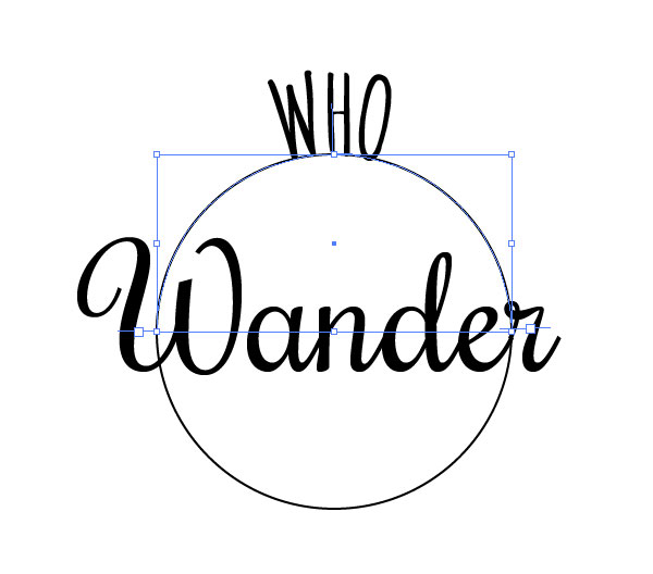
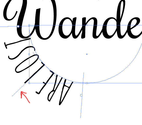
Step 6: Make a copy (Ctrl + C) of this text path and paste in front (Ctrl + F). Holding down the shift key, move the copy down a little bit. Input the text for your top line.
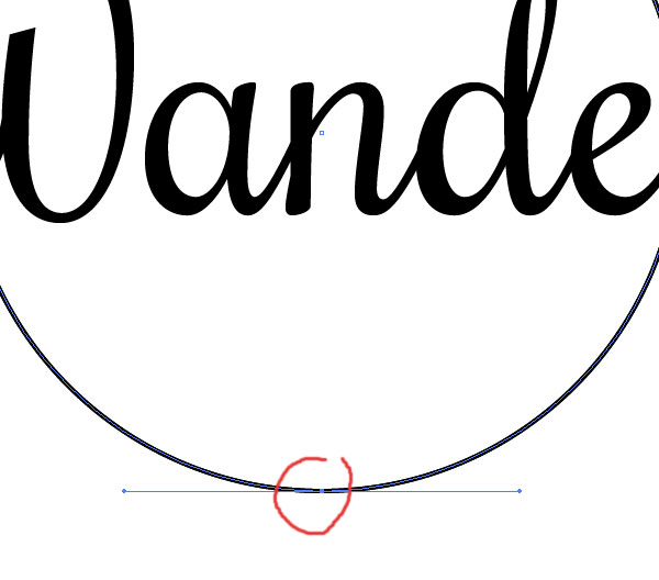
Step 7: Select the other circle copy and with the Direct Select Tool (A) remove the top node of the circle so we have a type path for the lower half of the circle.
Step 8: Type out your text for the bottom half of the layout. Your text will probably be upside down as you type. Don’t worry, after you are done typing, simply grab the middle guide line and drag it upwards until the text flips to the other side.
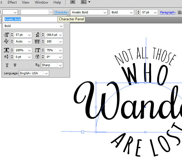
Step 9: Now we are going to adjust the text to fit together a bit better. I have lowered the size of the top text and increased the line beneath it so they take up approximately the same space. I also lowered the vertical scale of “WHO” and “ARE LOST” to 75%. You can make these adjustments through the Character Panel, which you will find at the top of your screen next to the font name.
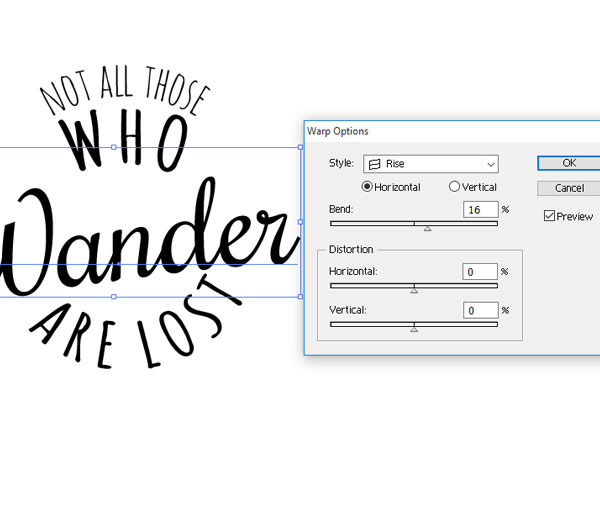
Step 10: Select your focus word. We are going to apply a slight warp to the text. Go to Effect > Warp > Rise. Change the bend to around 16% and hit OK.
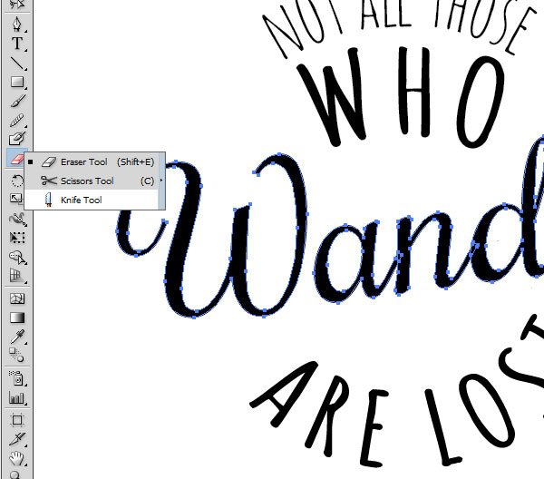
Step 11: I am going to make some small adjustments to my focus word to give it a more custom look. This step entirely depends on your word, so play around with it. For my word, I am going to re-use the curl on the “W” and mirror it on the end of the “r”. To do this I expand my effect and outline my text (Object > Expand). You may want to make a copy before you do this just in case you don’t like the outcome.
Make a copy (Ctrl + C) of your main text and paste in front (Ctrl + F). Then, with the knife tool I am going to slice off the swirl of the “W” shape.
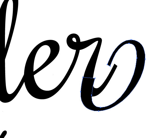
Step 12: Double click on your word after you make the slice so that you can delete everything but the swirl. I am going to drag the swirl over to the end of my word and rotate it until it fits naturally with the existing letter form. You can see there is a little bit of an overlap that doesn’t fit. We are going to fix that.
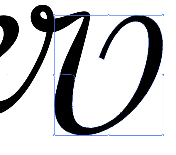
Step 13: Using the knife tool again, I am going to slice off some more from the end of the “r”. Double click on the shape and delete the parts you cut out. Then, with the Direct Select Tool (A) grab the side nodes and drag them until they fit in with the shape.
Step 14: Make any other adjustments to the text so that it fits together. Now we are going to make our compass lines.
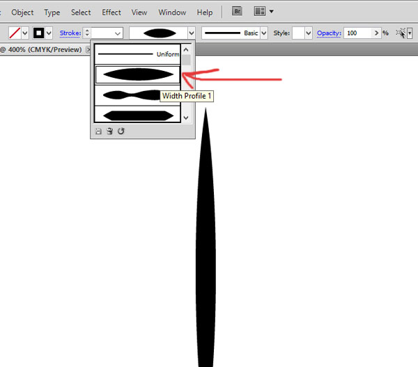
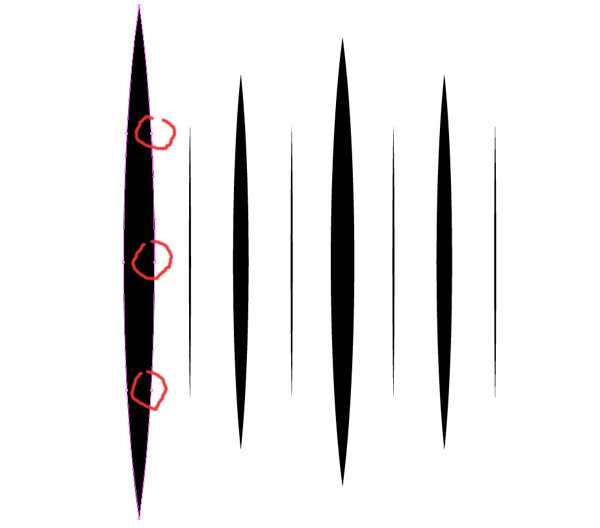
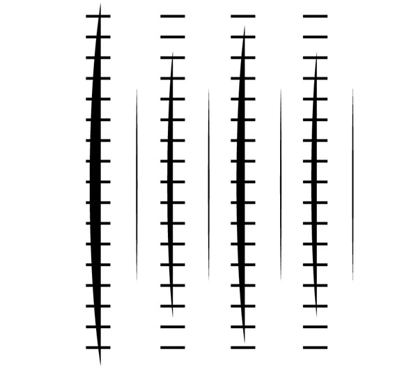
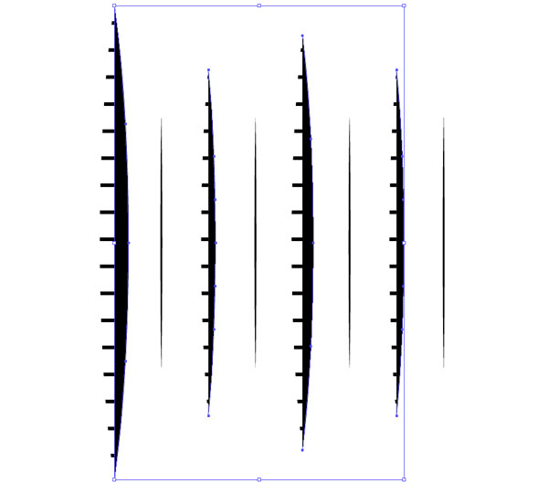
Step 15: Using the Pen Tool (P), make a straight line with a simple black stroke and change the Variable Width Profile to #1. Increase the stroke size so that this stroke is fairly thick (I used 8pt).
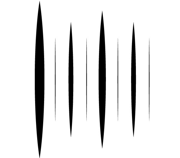
Step 16: I am going to make 7 copies of this stroke and adjust the height and size of the stroke for each one until I have a set of lines as shown. The thinnest strokes are set to 0.5pt, the next size up is 4pt, then 6pt, with our original 8pt line being the thickest.
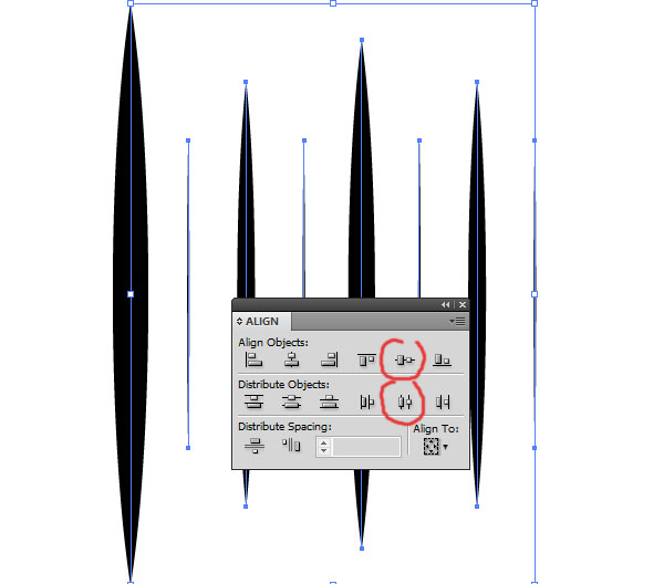
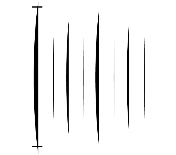
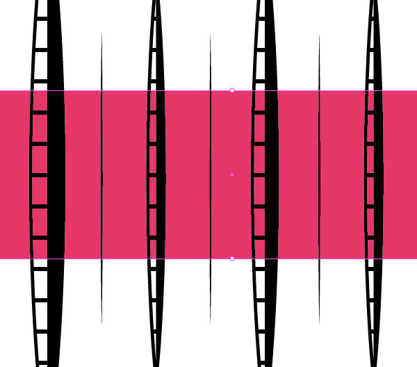
Step 17: To make sure they are evenly spaced, select all of the lines and through the Align Panel (Shift + F7) click on “Horizontal Distribute Center” and “Vertical Align Center”.
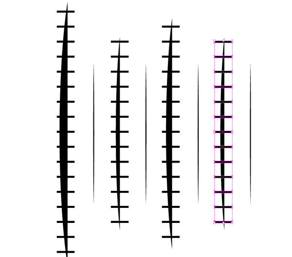
Step 18: I am now going to make two copies of these lines so we have a total of 3 copies of the line set separated on 3 different layers. When you paste the copies make sure you paste in front (Ctrl + F) so that they are lined up properly.
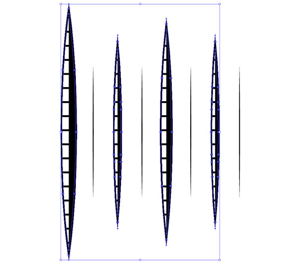
On the top layer, select all the lines and expand the stroke (Object > Expand Appearance). For the 4 thick lines, I am going to delete the nodes on the right side of each object. Using the Direct Select Tool (A) select the three nodes on the right side of the main shape and hit delete.
Step 19: Do the same thing for the rest of the larger stroke shapes. This will give you a shape that is half the original.
Step 20: We are going to use the blend tool to create some horizontal lines running through the shape we just made. Using the pen tool, create a small horizontal line that runs through the first shape. Set the stroke to 1pt. Hold down the Alt key to copy the line and drag it down to the bottom of the shape.
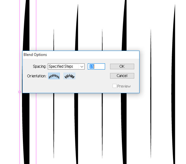
Step 21: Select both of the horizontal lines and go to Object > Blend > Blend Options. Change the spacing to “Specified Steps” and put in a number around 15 (you may need to adjust this number depending on the size of your shape). Hit OK, then go to Object > Blend > Make. If you find that you need to adjust the line spacing, just go back to the Blend Options and adjust the number.
Step 22: Make a copy of the line blend and drag it over top of each of the shapes. Holding down the shift key as you move them will keep them lined up properly.
Step 23: With all of your line blends selected, go to Object > Expand. With all boxes (Object, Fill, Stroke) selected, hit OK. Sometimes this won’t expand the strokes, so if your strokes do not expand do Object > Expand again.
Make sure to delete any of the horizontal lines that are not over top of any shapes.
Step 24: Select the original half shapes and make sure that they are on top of the horizontal lines. Select all of the half shapes and to go (Object > Arrange > Bring to Front). Working with each line one at a time, select both the horizontal lines and the half shape and through the Pathfinder Panel (Shift + Ctrl + F9), click on Crop. This will leave us with just the horizontal lines.
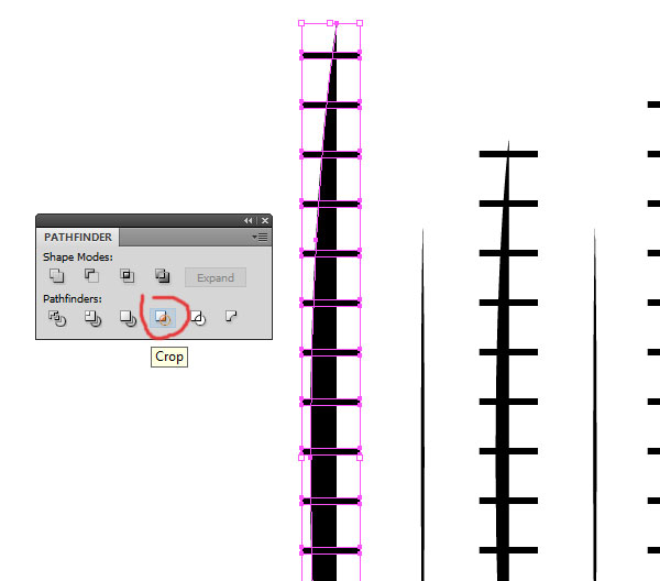
Step 25: Do the same thing for the rest of the lines. There are a number of other ways that you can do this, but most of them end it a more complicated file and some of them (such as using a clipping mask) will not allow us to turn it into a brush later.
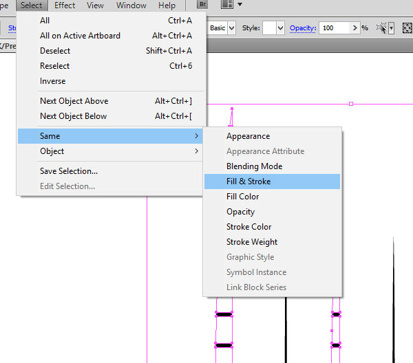
Once you have cropped all of the shapes, draw out an object with the fill and stroke set to nothing. Then go to Select > Same > Fill and Stroke. You can see this selects a bunch of invisible objects that we don’t need. Hit Delete to get rid of them.
Step 26: Turn on the layer below, which should have a full copy of the whole line set. Just like in step 18, I am going to expand the stroke and delete the side nodes off each large shape, only I am going to delete the nodes on the left. I am also going to delete the thinnest lines from this set (we only need one copy of those thin lines).
Step 27: Turn on the layer below this one. Again, delete the thinnest lines. Select the thicker lines and expand the stroke. Then, remove the fill color and change the stroke color to the same black and then adjust the stroke size down a little bit (0.75pt in our example). Object > Expand the strokes for this layer.
Step 28: Almost ready to make our brush. Unlock all of the layers that have our compass brush elements on them, and then select all of the shapes. With everything selected, open the Pathfinder Panel and click on Unite. This will combine all of our shapes.
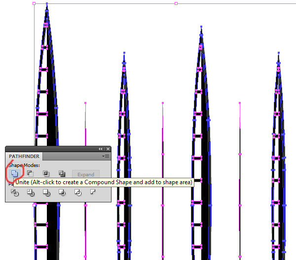
Step 29: This should leave you with only the black shapes that are going to make up our compass brush. You can place an object below the lines to make sure that the background is coming through. Also make sure that your color is set to CMYK with the K set all the way up to 100%.
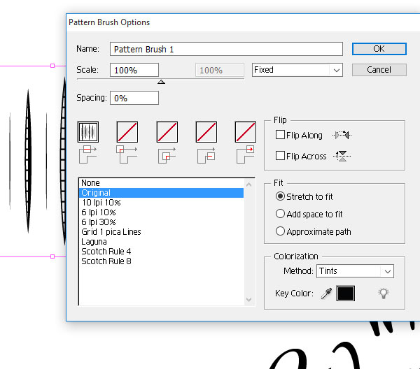
Step 30: Now we are going to make some brushes. Select your lines and drag them over to the brush panel (F5). You will get a pop up window to select the brush type. Select Pattern Brush and click OK. Change the colorization method to Tints and click OK.
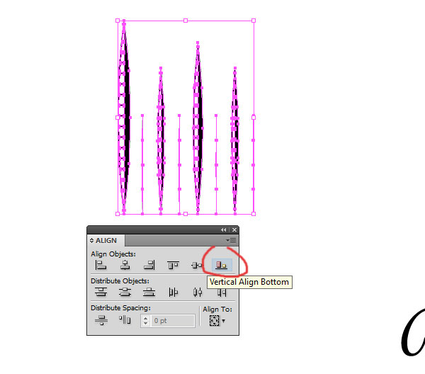
Step 31: We are going to make a second brush. Select your lines and ungroup them (Object > Ungroup). In the Align panel, select “Vertical Align Bottom”. Create another pattern brush like you did in Step 30.
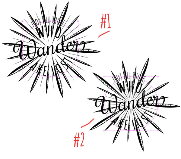
Step 32: Draw out a circle over top of your text design and apply one of the brushes to it. You can see the difference between the two brushes here. Try both brushes and see which one fits best with your design. For our example, I am using the bottom aligned (#2) brush.
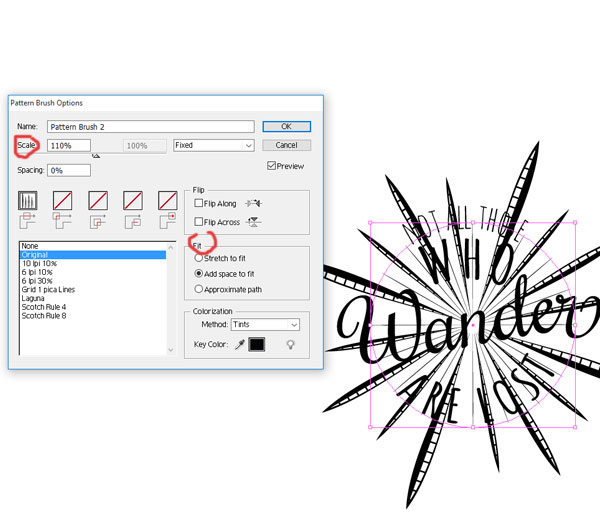
Step 33: The first thing I want to do is adjust the brush so that I have a smaller number of points. Since I want the compass theme to stick out, I will adjust so that I only have 4 of the largest points. To do this, double click on the brush in the brush palette so that you can make adjustments to the brush options. First I change the “Fit” to “Add space to fit”, and then I increase the scale of the brush to 110%. Click OK when you are happy with the results. You will get a pop up that asks what you want to do with the changes, click on “Apply to Strokes”.
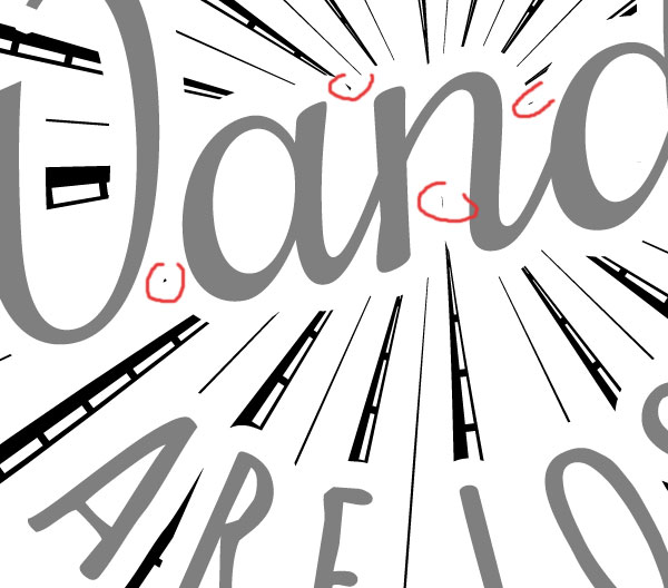
Step 34: I rotated my circle shape so that the “East” and “West” points line up with my main text. Once you are happy with the layout, expand your brushes shape (Object > Expand Appearance). Now we can clean up the bits that are overlapping our text.
Step 35: Now, you can use whatever method you would like to clean up the overlapping areas, but I am going to show you a way to make it a little faster. First, make sure that you separate your text from the compass shape. The text layer should be above the compass layer. We are going to make a copy of the text layer and place it between the original text and compass design layer.
Select the text in the copied layer and expand everything. With all of the expanded text still selected click on “Unite” in the Pathfinder Panel. Then go to Object > Path > Offset Path. The offset size will depend on the size of your art, but we are using 4pt and a “Bevel” join. You can click on the preview to see how large it is going to be. Hit OK when you are happy.
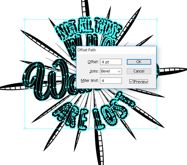
Step 36: After you hit OK, you can change the color to white to see what it will look like. If you aren’t happy with the way it looks, undo (ctrl + z ) the offset and adjust the size. If you are happy with it, we are going to now prepare the offset to use as a sort of stencil to cut the compass shape. Select all of the newly offset shapes. In the Pathfinder Panel, you are going to first click “Unite”, then “Trim” then “Unite” again. This will remove all the overlapping shapes as well as the areas inside the letters. If this process changes the color of your shape, change it back to white.
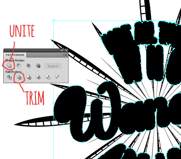
Step 37: Make a copy of your compass shape and paste it behind your white “stencil” shape. With both the compass and stencil shape selected, click on “Trim” in the Pathfinder Panel. This will remove any of the compass that lies behind the white stencil shape.
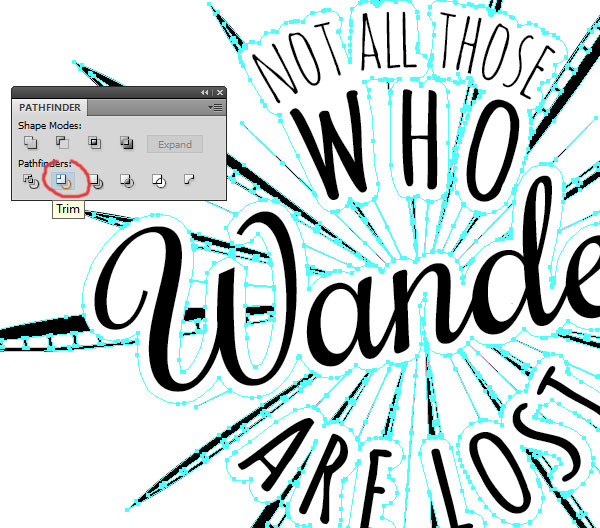
Step 38: Double click on any part of the white area to enter Isolation mode on this object. Select one of the white shapes then go to Select > Same > Fill color. This will select all of the white areas. Delete all the white objects. I drew out a rectangle behind everything so you can see we have no white areas here.
Step 39: Zoom in and double click the compass shape and delete any stray bits that don’t look right to clean it up. You can also use the knife tool to cut away some of the larger shapes.
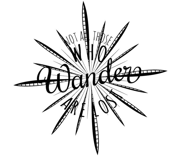
Step 40: Finally, I make a few final adjustments and added the colors (background #DCD5C8, design #52463F). Sprinkle a little grunge texture over top and we are done!
Here is the final illustration!