The first thing a potential client will see for your business is your logo. Visual and versatile imagery used on letterheads, business cards, office signage, and even website headers. Your logo plays a large part in presenting your company branding. As such, it needs to be memorable, identifiable, catchy and instantly recognizable.
It also has to help you stand out from your competition.
You ask a lot from your logo. So make sure you give it the tools it needs to do the job. Following these steps will get your business noticed before the rest of the crowd.
#1 Focus On Your Business

One of the first things you should do when designing your logo is to consider the business you’re in. The second thing is to think about your customers.
Your logo needs to speak to your potential clients. Business reputation and professional image depend on portraying what your business does and how well it can do it. More than a cool design, your logo is the hook that gets new and existing clients calling you on the phone, or walking through your door. Your logo doesn’t just attract people to you. It helps them recognize your business so they can keep coming back.
Consider what your business offers and how it can deliver your services when designing your logo. Who are the people most likely to use your services? What imagery speaks to them?
#2 Promote Yourself
It can be tempting to look at the logos of your competition and do the same thing. What works for them will work for you, right? Well, probably not.
Copying the logo of a similar business will create confusion. If the other business has been going for longer, the resemblance might make your clients think you are the other firm. Causing them to head for your competition instead of you. The other company doesn’t need you to promote them. They have that covered and can find their own work. Being too much alike will cost your business.
Worse than that, imitating another company’s logo could get you into all sorts of trouble with copyright infringements.
Always be original when you create your own logo. Pick imagery and designs that represent you and your business. To stand out from the crowd, you need to be unique.
#3 Adaptable Across All Formats
Logos are used on a range of different items. From marketing freebies like pens or USB sticks to posters, business cards, and your website homepage. Because of this, logos need to be adaptable.
Your logo design has to look good as a thumbnail or on a billboard. That’s quite a size difference. To keep you ahead of your competition, your logo must be able to make that leap without any loss in clarity. Or visibility.
Ensuring your graphics can adapt to every possible format scenario will keep your business looking professional and one step ahead of your rivals.
#4 Font Styles

It can be tempting to go to town on font styles. There are loads to choose from. Not all of them will go together though. Mixing a flowing handwriting script with a modern sans serif might sound great in theory, but how will it look on paper? What impression will it give your customers?
For one thing, the two styles are very different. Fonts are associated with a variety of characteristics. Sans Serif is modern, sleek, and uncluttered. While handwriting can be romantic, old-world and crowded. Your customers will be in a spin from the mixed messaging your logo is sending.
Ideally, you want to keep font styles to a minimum. Any more than two and your logo will start to look cluttered. It’s also a good idea to pick a family of fonts. If you like the look of a serif, make sure your different fonts are all serif. It will give a more professional, cohesive readability your clients will love.
#5 Color Scheme

The human brain loves color. So much so that a good memory technique is to associate what you are trying to remember with a color.
It’s the color scheme of your logo that will help people remember your business. With your logo at the forefront of their minds, it’s you they will call when they are in the market for your services.
That’s why the choice of color scheme is an important design feature of your logo. The colors you choose play an essential part in your logo’s successful promotion of your business.
Most colors can create an emotional response in people. Red can convey danger. Blue can be indicative of calm. Careful consideration should be given to your color choice to ensure your logo sends the right message.
A good color scheme will be both memorable and representative of your business. A combination of colors that speak for your reputation and business genre. The better the match of color with a company, the better your logo will be remembered by the color-loving brains of your potential clients.
That recall is what will give you the edge over your competition.
#6 Negative Space
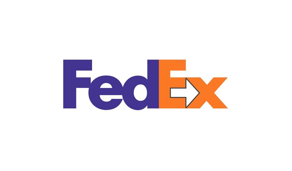
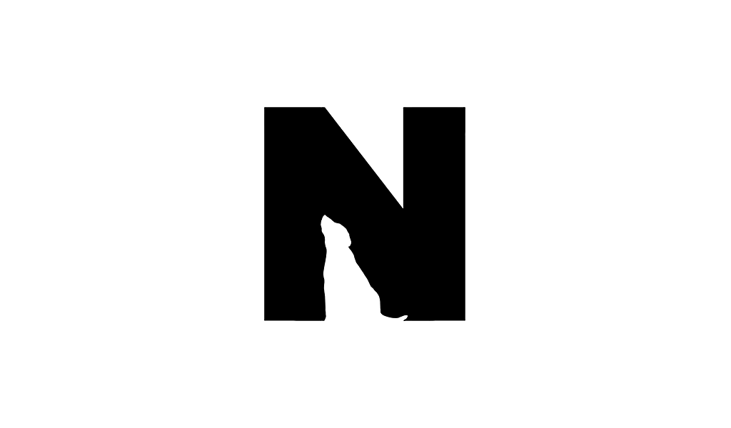
Sometimes the best part of a logo is the part that doesn’t have anything in it. Otherwise known as negative space. This is where your individuality and creativity can work together to give you a logo like no other.
Designing your own logo is one area where a bit of blank space is actually a good thing.
Empty sections can create shapes or images that portray your business and are uniquely relevant to you. Organizations can use this technique to great effect. The logo for Pittsburgh Zoo, for instance, is a tree. Blank space beneath the branches of the tree creates a gorilla on one side, a lion on the other. Ensuring the nature of business for the zoo is instantly apparent. Just by looking at its logo.
Negative space can make the difference between a run-of-the-mill logo and one brimming with design inspiration. The innovation thought and ingenuity behind the design will make you and your business stand out.
#7 Simple But Effective
There are lots of things to consider when designing a logo. From the choice of color scheme to the overall design. Your logo has to be the symbol of your messaging and your business brand.
Think of your logo as your business identity wrapped up in an image or avatar. The closer your logo can get to representing your business, the better it can perform as your business icon.
To achieve a great logo, it can be tempting to go overboard on all the design elements available to you. This can be incredibly confusing and have a disastrous effect. Over designed logos look cheap and can make your business look unprofessional. Instead of attracting clients, the logo will act as a deterrent, driving people away and through the doors of your competitors.
An effective logo doesn’t have to be complicated. Far from it. The best logos are actually very simple. Take the logo for Apple, for instance. It’s a simple image of an apple. Instantly recognizable and memorable. Therein lies the secret to an awesome logo.
It needs to be instantly recognizable and memorable. Your logo doesn’t need to be full of bells and whistles to represent your business. The first rule of a successful, memorable logo is to keep it simple.
Keeping your logo simple will better represent your business professionalism and integrity. Both of these are essential attributes to attract clients to you instead of other businesses in your field.
Following these tips will help you stand out from your competitors with a logo that is simply iconic.


